

Orbit, our pilot for a music discovery service, lets you find your next favourite song by exploring recently played ��ѿ��ý Introducing tracks. Every track is a crossroads where you have to decide with your ears: do you want to find out what you’re listening to, or do you want to try a related track? You can quickly move through the spectrum of musical genres, discovering what interests you and moving past what doesn’t. There’s no AI and no recommendation algorithms — you decide.
This article looks at how we’ve designed the experience to give control of the music discovery process to users letting them find something to listen to in the moment. You can read more about the associated technical challenges in our other article.
Replacing the infinite vertical scroll
During research on the listening habits of young people, we learned that they didn’t feel music discovery was intentional anymore: it just happened through algorithmic recommendations or browsing social media. Consequently, they felt stuck in a box they hadn’t consciously chosen or designed and over which they had little control.
That’s because current recommendation algorithms learn from your habits as well as subtle signals like how long you listen to something and what you skip. Their recommendations are based on these signals and it’s hard to directly manipulate what the algorithm thinks it knows about you. Worse, they also assume that what it’ll recommend will be something you’ll enjoy and present it confidently in a linear fashion, not as a suggestion. Whether it’s social media, a playlist or a radio, these algorithms are tuned for consumption rather than discovery.
For discovery, a user needs to be able to give a direction to their exploration and the infinite scrolling pattern doesn’t leave much room for that. It’s up to the algorithm and what it thinks is best for you (which may lead you to stay on the platform for longer).
We want to give back the power to the users over their discovery, replacing algorithms learning from implicit behaviour with users making explicit choices.
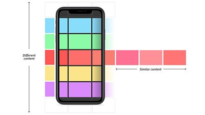
Imagine that instead of a linear delivery ordered by algorithm, you had a map of the content that you could explore with intention. When you find something that you like, you could keep going in that direction or turn and explore somewhere else. Applying this to the familiar vertical scrolling pattern, users could scroll horizontally to get similar things and keep scrolling vertically for something different.
It was a really organic feeling way to discover new songs really quickly and I LOVED knowing that they were all ��ѿ��ý Introducing artists - it felt exciting to know I could discover an artist that could explode into the next big thing.
However, for music, we wouldn’t want a user to randomly jump to an entirely different genre when scrolling vertically: the content would have to smoothly transition from one style to another. A binary choice didn’t feel like it properly represented the plurality of musical genres either. So we set out to find a new pattern that allowed users to be more intentional and nuanced about where they want to explore.
For nearly 20 years, unsigned and undiscovered artists have been able to submit their music through the ��ѿ��ý’s Introducing programme to their local radio DJs to potentially play on air. Hundreds of new tracks are played each week, and we thought new music that would be perfect for a discovery service.
To test our navigation idea, we selected 50 tracks from ��ѿ��ý Introducing and manually organised them in two dimensions: how danceable they were and how much singing there was. We made a provocative prototype where a virtual joystick moves you around the 2D space, each movement playing samples that progressively changed along our two dimensions - going right, the music would get more danceable and going left, it would get less danceable. The prototype did not show what the tracks were, as we wanted users to decide based on what they heard and not what they saw. We also hoped this would tempt them with something outside of their usual genres.
Participants enjoyed the novel navigation: it was fast to move through tracks and decide if something was worth listening to. They also liked that it would take them out of their comfort zones because they couldn’t be biased by the album art or the track title.
However, this pattern made it hard to understand where you were going and what kind of music you would encounter in a certain direction. In fact, you couldn’t move with intention because you couldn’t see where you were moving to until you got there!
Navigating the unknown
Multi-directional navigation had potential, but we needed to place the tracks meaningfully next to each other based on their sound as well as signposting the directions.
To organise the music more granularly than our two naive dimensions, we used machine learning to collect eight different features about each track and used that to create a connected web of relationships between the tracks recently played on ��ѿ��ý Introducing. That spatial representation resembles stars in the sky so we dubbed it the 'star field'. You can read more about this in our technical article.
Now we had to find a way to signpost the direction across this star field. Signposting is very effective on the road: signs tell you whether a motorway or a country lane is coming up. You can’t see the whole of the road ahead, but the sign is telling you enough to make a confident decision.
In our case, using signposting proved an impossible task. We would need to say things like “this way for something a bit more funky but also more electronic” and “that way for something more aggressive and distorted”. It reduces the music to a few detailed or complex words or icons which would be very sensitive to personal interpretation.
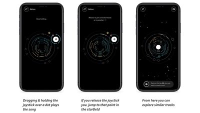
So for our navigation, we use a two step process: drag and hold the joystick over a track to hear a sample. If you like it, release and you will ‘travel’ there, accessing a new crop of similar sounding tracks. If you don’t, keep going and sample other tracks until you find a direction to explore. (It’s much more effective to ‘show’ rather than ‘tell’ in this context.) As you travel, genres will slowly change and you can move from rock, to funk, to hip-hop, to pop, without needing to understand or label these genres.
It's a fun, unique experience, which makes music discovery playful and engaging.
With this interaction, it’s quick to sample lots of tracks and find where you need to go, even if you can’t fully express what you want to listen to. If you like the sound of it, that’s where you’re going!
Finding a home planet
With such a wide selection of genres, it’s crucial to start your exploration with a tune that grabs you — something that speaks to you and what you’re feeling in the moment. We first used the descriptive features of the tracks extracted with machine learning (aggressive, happy, etc.) to label different starting points. However, we soon realised that (similarly to the navigation pattern) users associate different meanings to these words and we had to once again show, not tell them.
So we re-used the same navigation pattern but with a wide variety of styles instead of a cluster of similar tracks. This way, they can effectively choose a starting point by comparing each sample and choosing the one most similar to what they feel like right now. Comparing these tracks, users can just experience the music and make a decision based on what they hear and not our descriptions. We also used this opportunity to explain the core interaction pattern, effectively turning it into a kind of tutorial.
Additionally, if you find yourself in a corner of the star field that you do not like, you can always go back to this first screen and get a fresh starting selection.
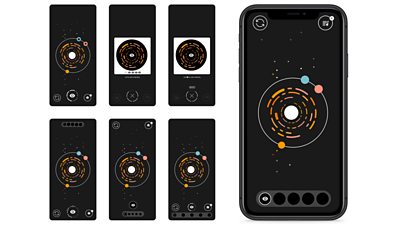
We wanted to help users make better and faster decisions about what to sample and where to go so we eventually refined the interface to visually differentiate unexplored, listened to and visited tracks so you don’t have to listen to something multiple times (unless you want to). To help users travel more efficiently we made clear what tracks are similar and which are more different from the centre track with two visual tiers: close tracks that will sound more similar are on the inner circle and those that are more of a departure are smaller and on the outer circle.
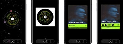
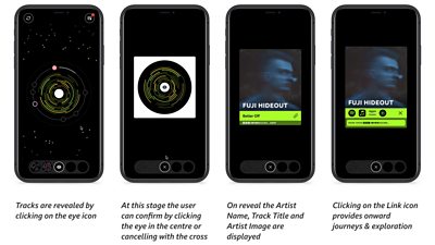
Mystery artists
You can add tracks you like to your collection by revealing it. This displays the artist, title, and artwork. Links are provided to find the track on streaming platforms to listen to it in its entirety.
It’s an incredibly interesting concept, and I love how it supports ��ѿ��ý Introducing artists from all over the UK. Not only that, it shows a fantastic spectrum of different artists and genres that wouldn’t otherwise have been discovered, especially whilst they’re up and coming in their local music scene. It helps potentially new fans get ahead of the game and discover their new favourite artists before they blow up!
During our research, users responded well to the track data being hidden until explicitly revealed. They thought it would encourage them to explore beyond their usual genres. However, it was also clear that they didn’t want another platform that would trap them and waste their time.
We combined the requirement to make each reveal meaningful and value the users’ time, giving users the ability to reveal five tracks a day, after which the experience is finished (but they can still listen to their previously discovered tracks). We wanted the experience to be more akin to a service like the weather forecast that you can use and move on. The limited number of reveals provide a natural end to the experience so you don’t feel like you have to keep exploring but also encourages users to be more discerning about what they reveal: they have to make each one count.
In terms of design, we explored various options to count down the reveals and communicate their limited nature, but we found that counting up using clear visual slots communicated the best.
I wanted more than 5 discoveries, but also, I like having the limit so that what I’ve found and selected is more special somehow.
Additionally, if you use Orbit regularly, you will slowly build up a collection of artists and tracks you’ve discovered that’s always accessible. We wanted to give users ownership over their discoveries with a memorable feeling of surprise when they find something they like.
Making digital grooves
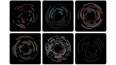
We were concerned that by hiding all track information, the navigation would be visually bland, so we were keen for the music to have visual representation. The first prototype had crude spinning sine waves that research participants seemed to enjoy, but we wanted something more meaningful. Having lots of data points about each track, we could use this to visually represent what the track sounds like.
We started with colour gradients shifting in hue and displacement as you moved, but it was too subtle and it sometimes felt like you hadn’t travelled to a new track. We had to balance the need to visually differentiate the tracks and the need to communicate their sonic proximity and relationship.
We tried a handful of generative visualisations powered by our ‘star field’ data: how aggressive, happy, sad, danceable, instrumental, party, relaxed sounding it is. The most successful visualisation resembled a vinyl record with a series of grooves. The speed of rotation, the number of grooves, their thickness and how broken up they are is dictated by that data. Since tracks that are next to each other will have smaller differences across these data points, their visualisation will be similar yet retain the characteristics of the track: as you navigate towards more aggressive tracks, you may notice that the visualisation increasingly appears broken up.
We don’t expect users to notice this or rely on this for navigation, it’s just another element of the design showing a subtle hint of the order behind the apparent randomness.
I think it is a fantastic tool. I came across so many hidden gems!
The last piece of the puzzle was choosing colour schemes. In our trials, it became obvious that colour was a much better differentiator than any visual changes when moving between tracks. Different colours in the navigation UI can also help more quickly identify which track you want to come back to if you’re sampling a lot.
Initially, we used randomly generated colour schemes but soon realised we could give each track more personality by associating it visually with the ��ѿ��ý Introducing region where it was submitted. We created a unique colour scheme for each region so now if you see two tracks from with the same scheme, that’s a hint they come from a similar part of the UK.
Cutting a release
When we started, we wanted to bring back some of fun and excitement of flipping through records in a bargain bin when discovering new music. It’s all well and good to take a recommendation from the record shop, but you don’t really know if you like it until you listen and the music connects with you, sometimes in unexpected ways.
By relying on a show-don’t-tell approach, users can experience the music for themselves and make explicit decisions based on what they hear and not what’s described to them. This encourages them to try a wider range of content and take back ownership over their discovery process. The result is a new way to organise music organically and an interface that makes browsing quick and effortless so you can find your next favourite artist.
In the first 3 months of the trial, we had over 7000 tracks come in and out of the star field and over 1,000,000 samples requested, with users listening to just over 30 samples per session. It’s a very promising start and we’re sharing the findings with our colleagues to see how we can best take Orbit forward.
More on Orbit
If you haven't already, check out the first article in this series, which explains how the music tracks are organised behind the scenes which makes this kind of navigation possible.
Search by Tag:
- Tagged with Content Formats Content Formats
- Tagged with Audience Research Audience Research
- Tagged with Audio Audio
- Tagged with Content Discovery Content Discovery
- Tagged with Interactivity Interactivity
- Tagged with Recommendations Recommendations
- Tagged with User Interfaces User Interfaces
- Tagged with Features Features